Asset Library
Retal
BRAND
- Asset Library
Asset Library

01. Logo Design
The “Retal Urban Development”
01. Logo Design
- Primary Logo
- Minimum
Primary Logo Sizes
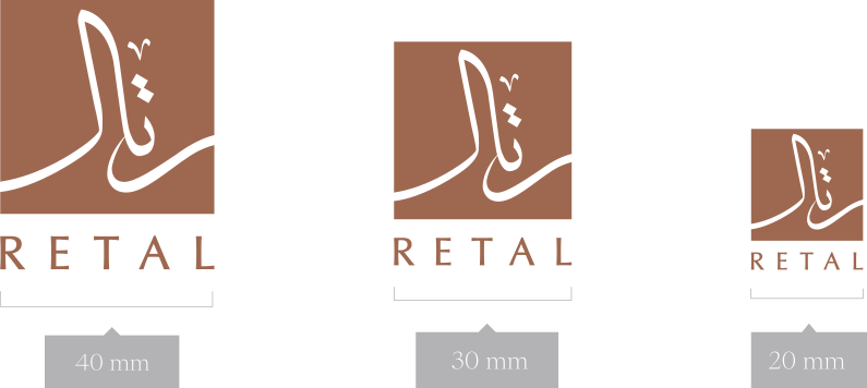
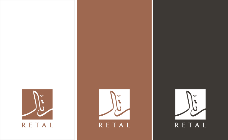
The logo is designed to be
versatile and adaptable across various backgrounds, ensuring it remains visually striking and recognizable.
- Logo in Colors
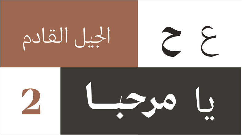
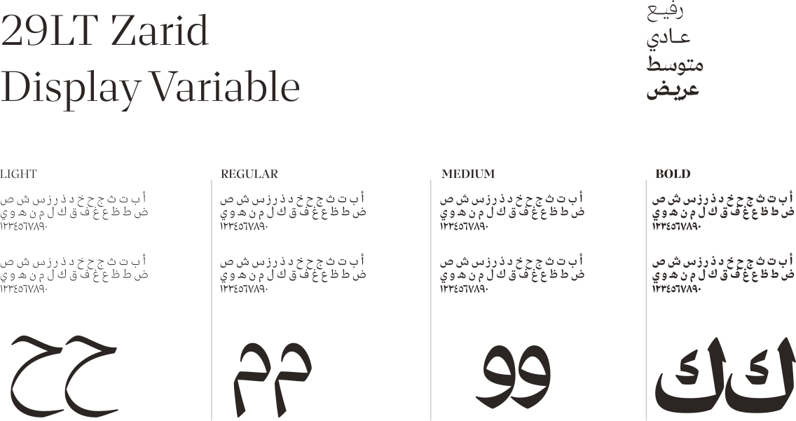
Arabic font
29LT ZARID Display:
A Contrasted Typeface
29LT Zarid Display is bold by nature and extreme in character. Its evident strong contrast between thick and thin pen strokes is abrupt and dramatic. Zaid Display type family is intended for display uses and consists of 4 weights: Light, Regular, Medium, and Bold.
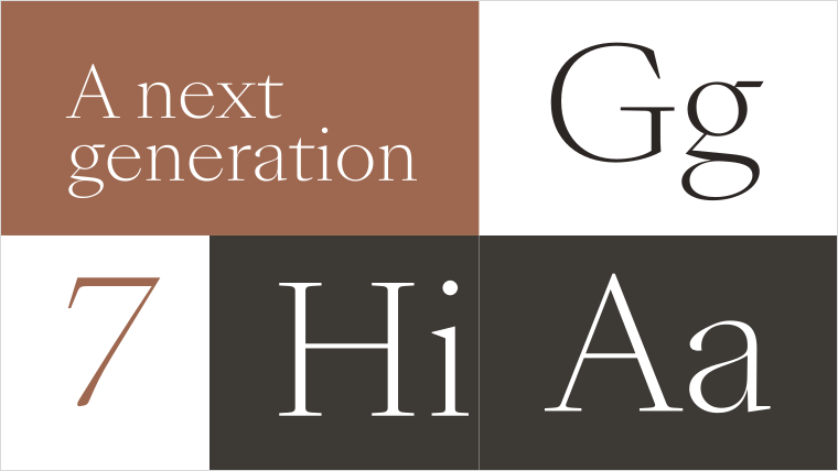
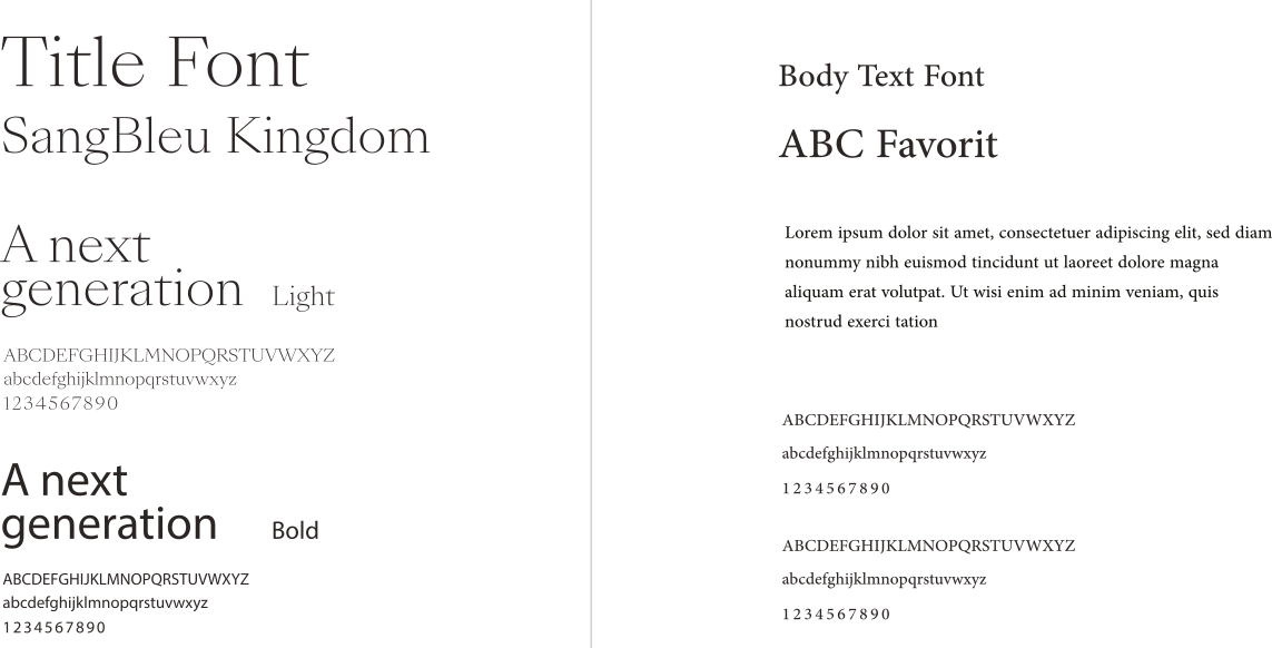
SangBleu Kingdom
SangBleu Kingdom is a member of the SangBleu series designed by Swiss Typefaces between 2007 and 2017. It fits between SangBleu Empire and SangBleu Republic, in regard to letter shape and contrast. The family is available in five weights with matching italics.
ABC Favorit
ABC Favorit is a straightforward, low-contrast grotesque that combines geometric rigidity with subtle oddities and a humorous touch. It’s available in five weights with corresponding italics, as well as a few special cuts and an underlined version, Favorit Lining.
- English font
03. Color System
Main and Primary Colors
- Inspirations
and studies
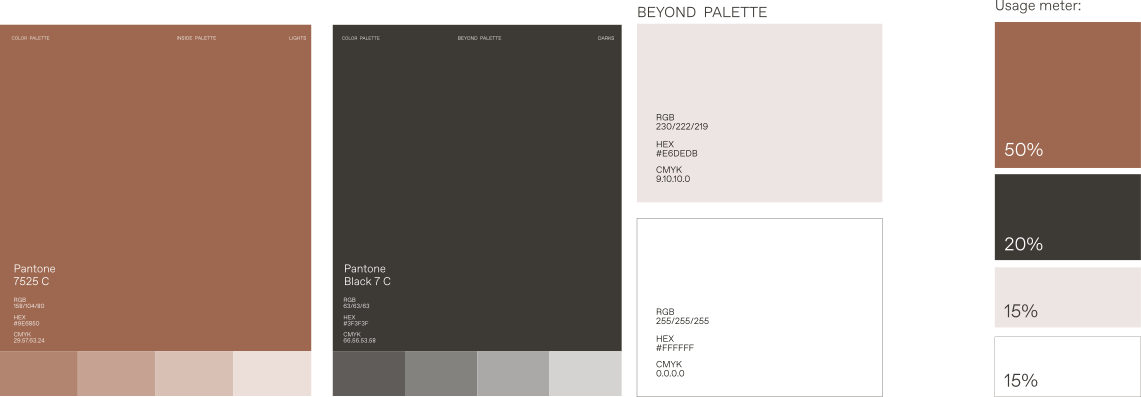
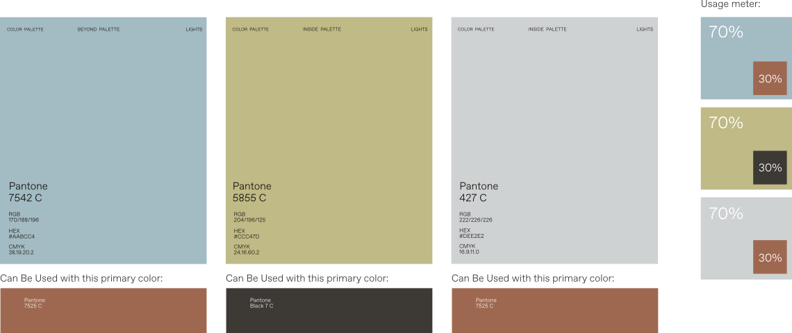
Secondary Colors
05. Iconograpghy
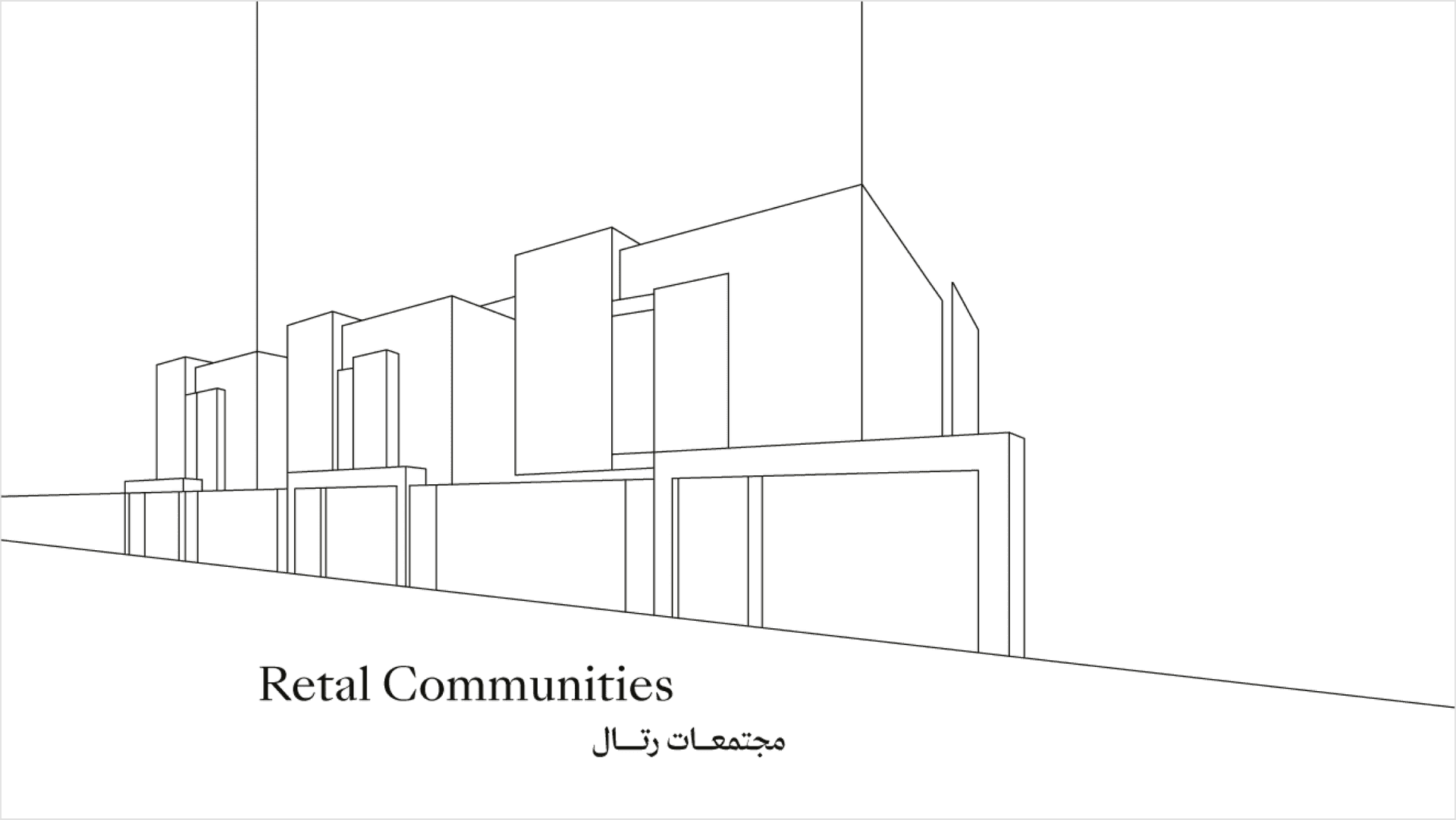
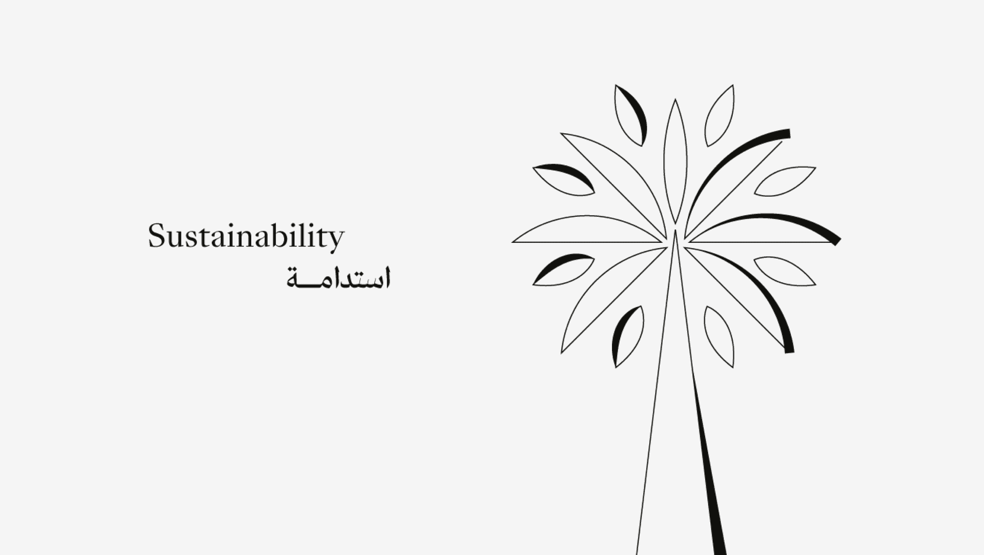
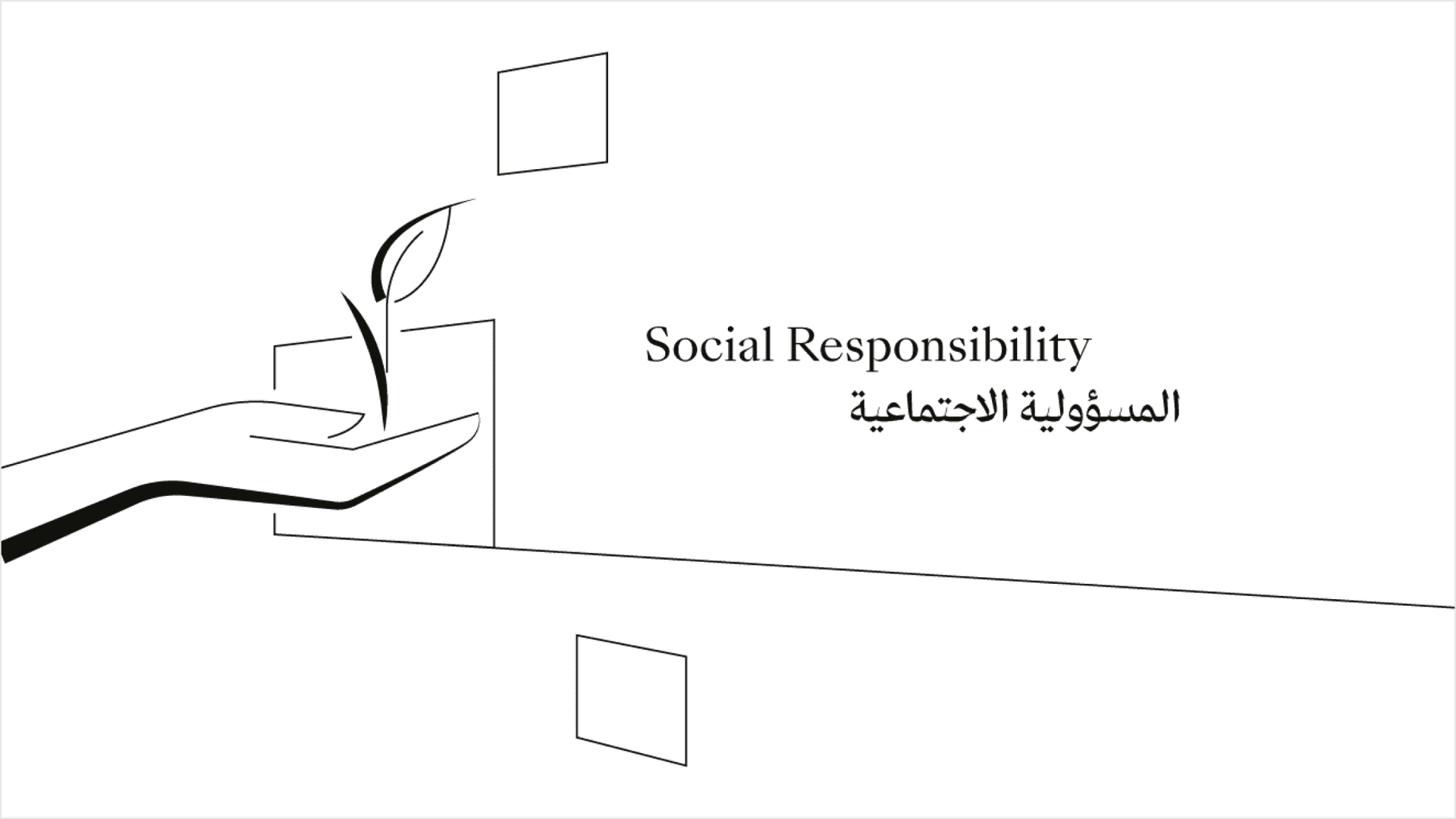
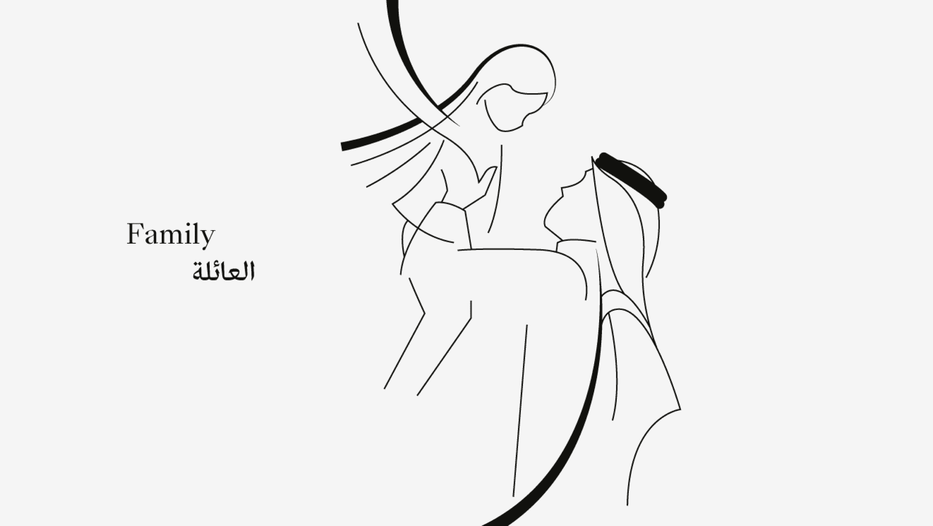
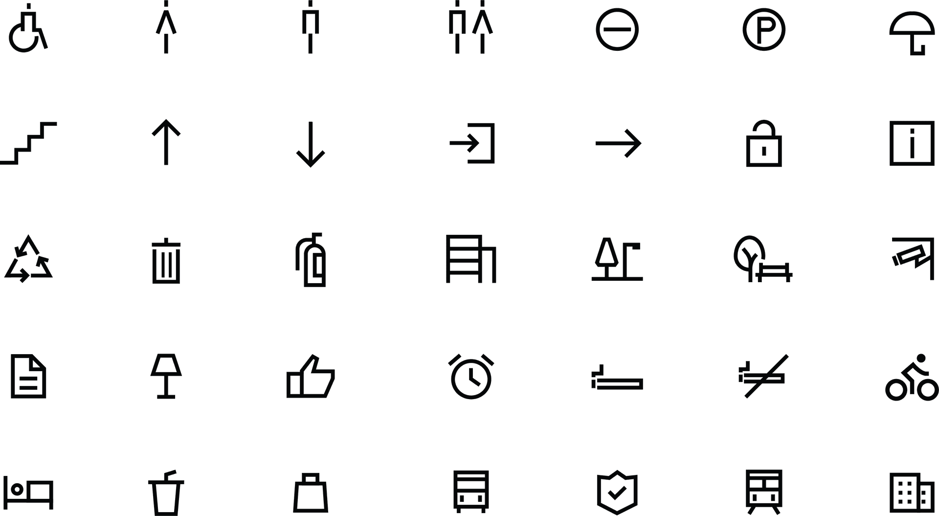
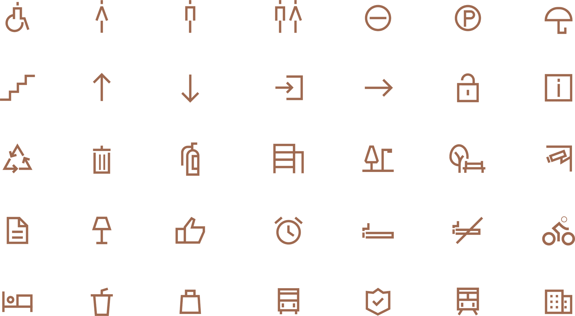
A minimalist and modern design
characterized by clean, thin lines and simple geometric shapes.
The monochromatic color scheme, typically black on white, enhances visibility and versatility across various applications. Designed for clarity and functionality, these icons effectively convey essential information and services, such as accessibility, navigation, amenities, public utilities, safety, and leisure activities. Ideal for urban development projects, the icons not only serve practical purposes but also contribute to a cohesive and aesthetically pleasing visual environment.
Black
Brown
White

06. Slogan
"Build for Generations" captures the essence of Retal Urban Development's mission.
It signifies a dedication to creating enduring value through high-quality, sustainable, and community-focused urban development. This slogan is a promise to current and future generations that Retal is committed to building a legacy of excellence, innovation, and care for the environment and society.